Flores de Remedios
FLORES DE REMEDIOS
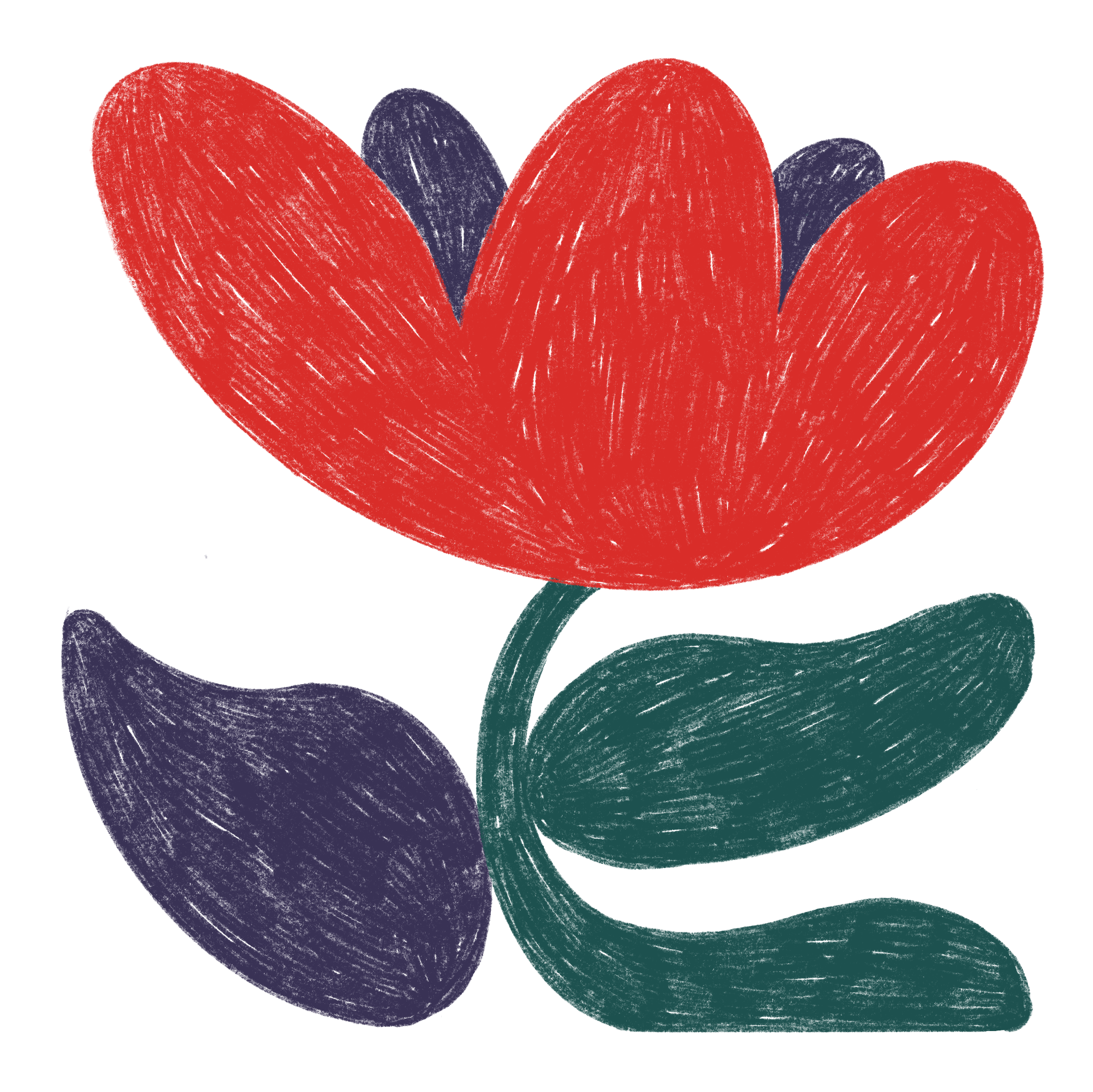
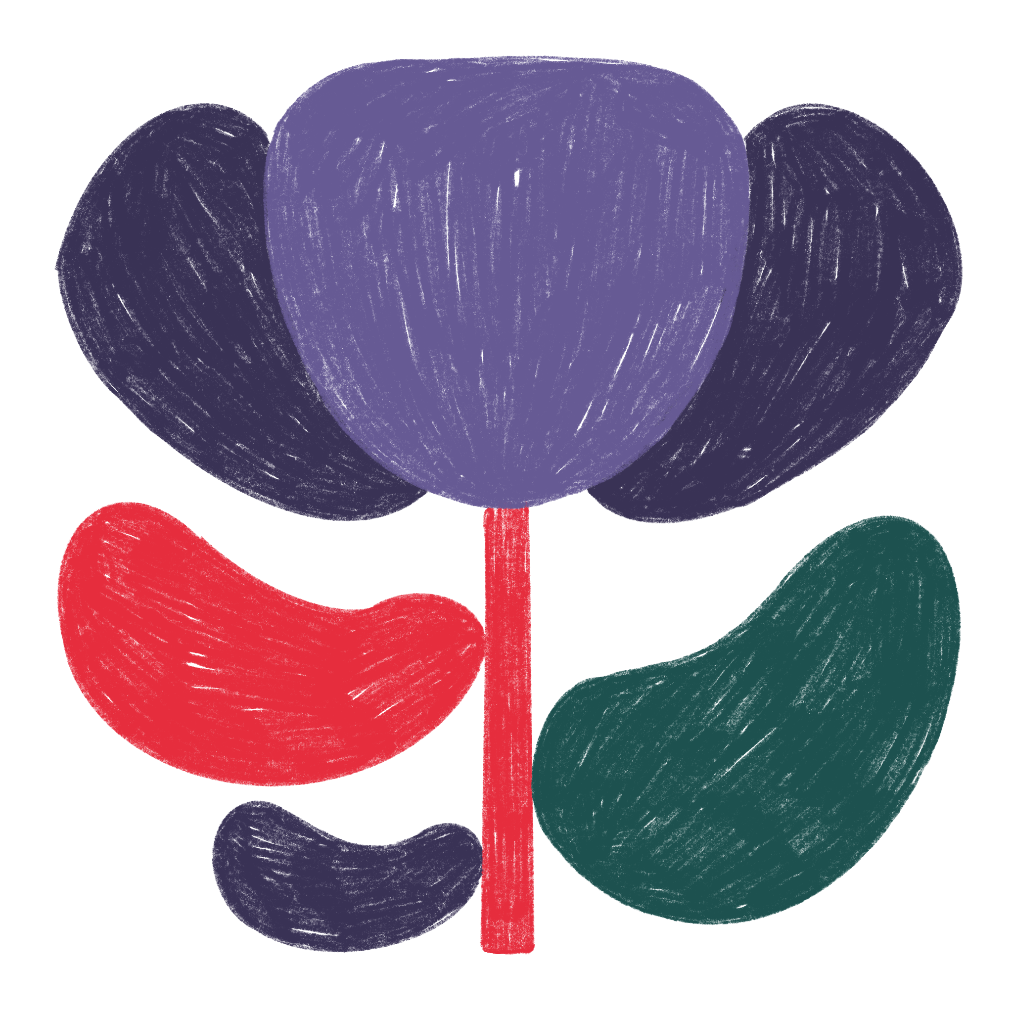
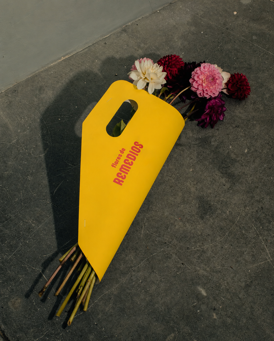
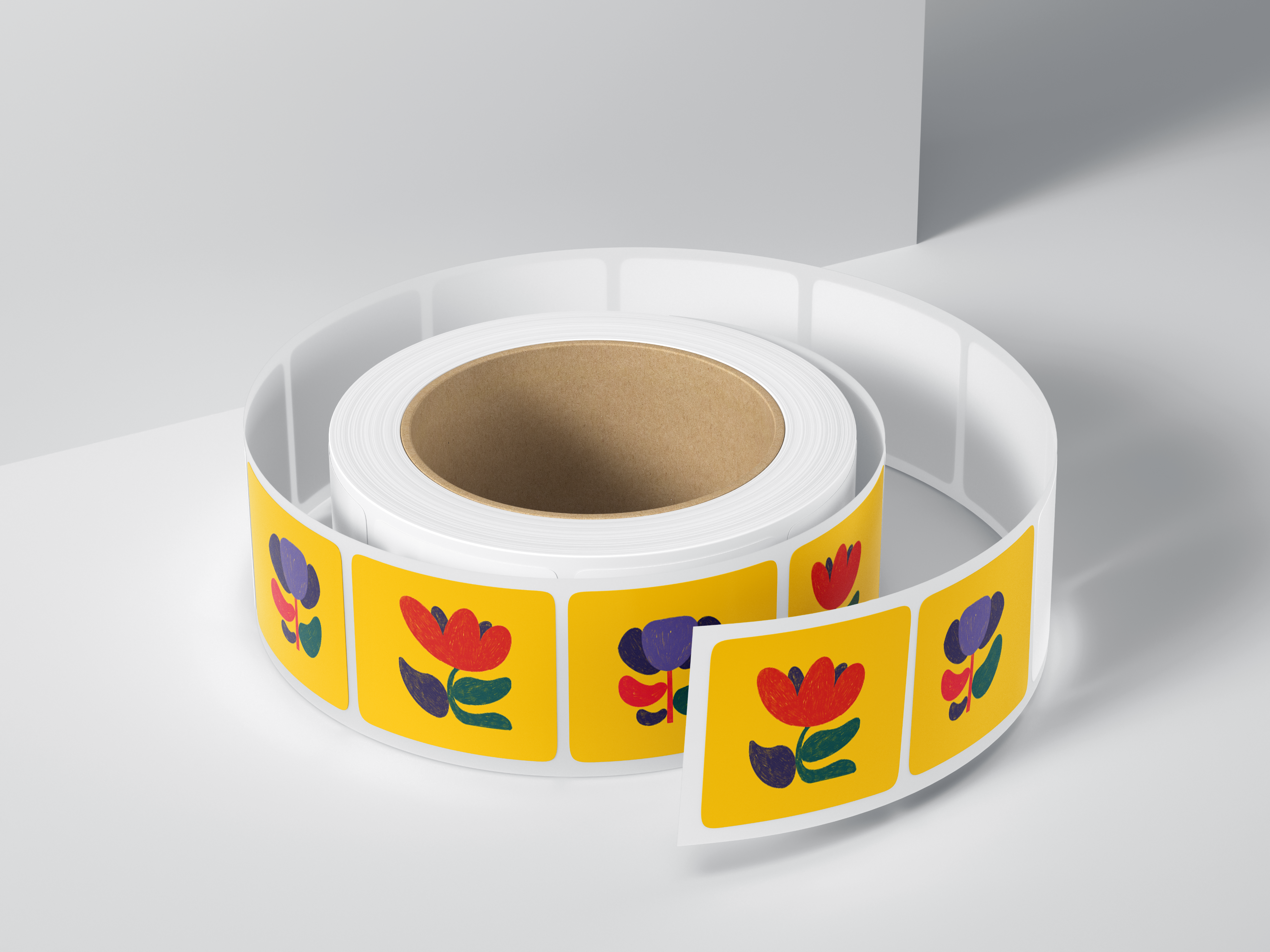
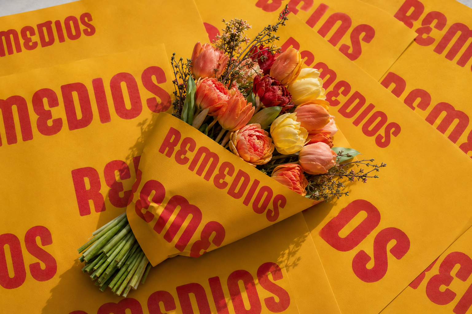
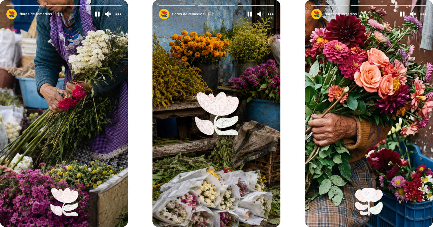
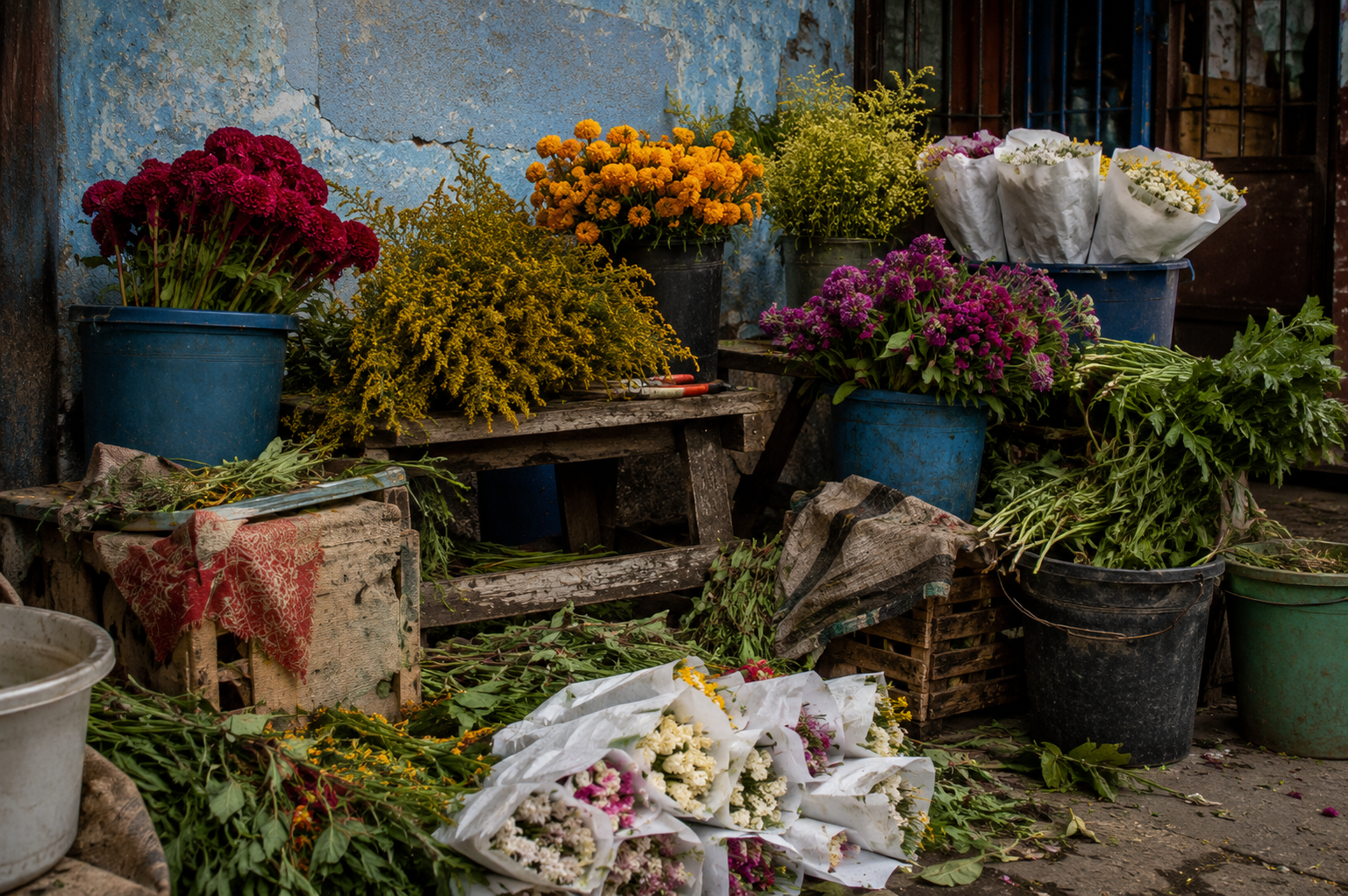
Brand identity created for a floral business with the goal of standing apart from conventional floral brands. The visual direction draws inspiration from authentic craftsmanship and cultural influences, combining expressive typography, handcrafted illustrations, and a vibrant color palette to create a warm, memorable, and distinctive identity. Rather than relying on the delicate aesthetics often associated with florists, the brand embraces a bold visual language that celebrates character, authenticity, and individuality while remaining approachable and recognizable.
Approach
The identity moves away from conventional floral aesthetics, drawing on craftsmanship and cultural references to create a brand with a strong sense of character. The approach focuses on making the business feel expressive, distinctive, and human.
Visual Language
Expressive typography, handcrafted illustrations, and a vibrant color palette form the core of the visual language. Together, these elements create a warm and recognizable identity that celebrates authenticity and individuality.
Merlod Autre
FDC50E
E62D3D